KOMS Praha · 2010–2015
Industrial piping in a unified style
A supplier of industrial piping systems got a new logo, a unified visual style and a trilingual website with references.

A unified visual style
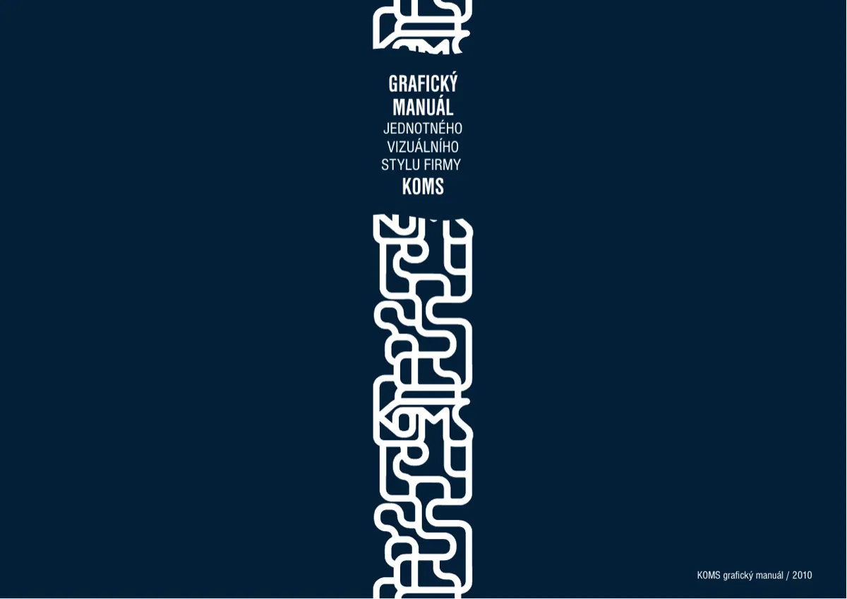
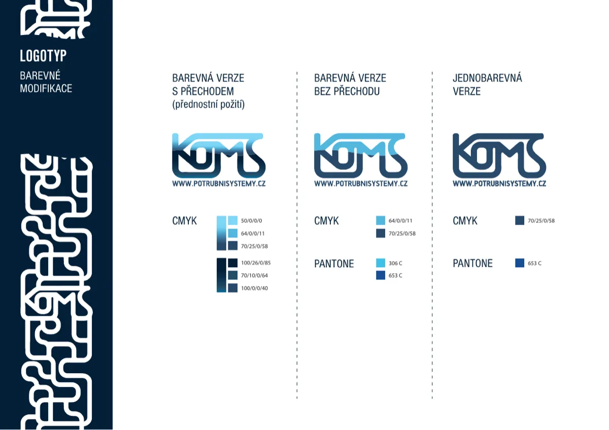
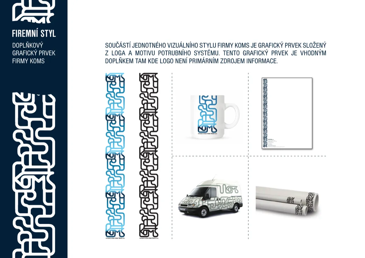
A logotype with full-colour, single-colour and Pantone variants, corporate colours (blue, azure, dark blue) and the Nimbus Sans typeface. Plus a supplementary graphic element: the logo extended into a piping system motif. It works on a mug, letterhead, a car and directly on the pipes. The complete manual and all logo variants can be downloaded at komspraha.cz/logo.
Analysis
A technical B2B field where customers search by what they need to transport and how: industry, material, medium. The references are therefore not a gallery but a filterable catalogue.
Solution
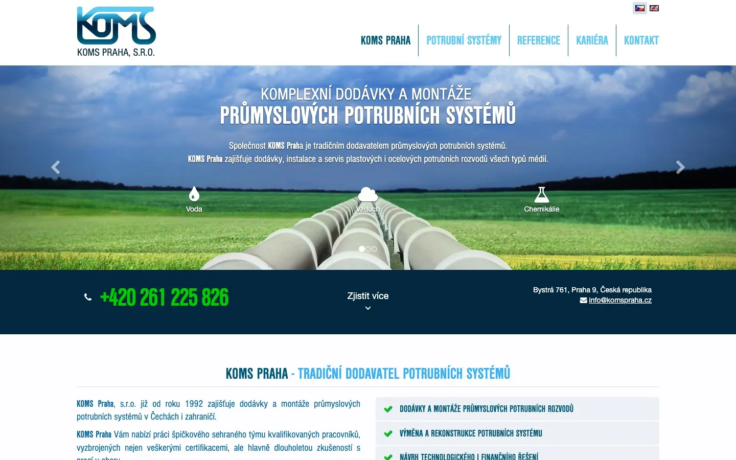
A website in Czech, English and German; piping systems, references sorted by industry, field, material and medium; careers; contact and service requests.
Result
The website still runs on BCT today; a new version building on it is in preparation — the cover image of this case study is its new visual.